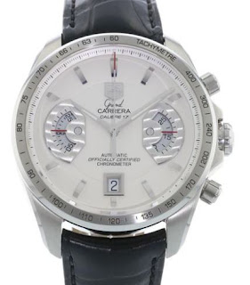
CAV511B.FC6225
TAG Heuer Boutique / York, 21st July 2018
Here's a post that got lost in the shuffle, and typical that I should find it again when I have plenty of things to write about! Nevertheless, it's worth revisiting especially in the light of my recent disposal of my own Grand Carrera GMT. Essentially this is the same as the black dial variant that I've tried on several times and I'm still weighing up as a possible future purchase. So while I was visiting the York boutique (this was the same day that I drove up to Wakefield to pick up my wife's Alter Ego) I noticed this one lurking in the cabinet and it struck me that I'd never seen it before and thought I'd give it a go.
43mm in diameter and 14.9mm thick, the Grand Carrera is a sizeable watch, but wears quite well on the wrist and doesn't really seem as thick as it is. If I was to pull the trigger on a GC Chrono I'm very unlikely to buy it on a strap, but the strap was quite a good one and it's nice to see a deployment clasp fitted which makes it so much easier to take the watch off and on. But let's cut to the chase, what this try-on was all about was the white dial and, in all honesty, though I really wanted to like it, I have to say that the black dial is much more attractive to look at. When you see macro shots of the dial it does look fantastic, but the one thing that's missing is the contrast you get when you put those milled and polished surfaces against a darker surface.
Admittedly I'm not a great lover of white dials, I only have one in my collection, but as you can see from the pictures here the dial is a bit of a whitewash. To be fair in reality it is perfectly legible, but somehow it doesn't come over as well as the black, brown and (Japan only) blue versions. I'm not entirely sure the strap helps it any in this regard either, it does provide some contrast I suppose but seems to make the dial even more bland than it already is. I can't help but think this one would have benefited somewhat from a coloured logo, maybe not the traditional red and green, but certainly a darker colour, something, anything to give it a bit of contrast really... even just black would have been better than yet more silver to be honest.
Finding this post again has reminded my how much I like the Grand Carrera chronographs, but I'm still wary of investing my money into one. I really wish I hadn't made the mistake of buying the GMT, but it's done now and at least I've come out of the deal with two nice watches (well one nice watch so far, as the other one is probably going to be another couple of weeks before the chronograph function is mended).
Anyway, time is a great healer and I'm sure it won't be too long before I'm sniffing around the Grand Carreras once again, I'm sure if one of those 300 blue dial Japanese limited editions turned up it would focus the mind somewhat. No doubt that will happen right after I've blown my budget on something else...


Comments
Post a Comment